
Notion Colors
Unlock the secrets of Notion's color scheme with our detailed exploration. Learn how Notion's own colors contribute to its intuitive design and how you can utilize them to create an organized, visually appealing workspace.

Welcome to the colorful universe of Notion!
This article delves into the unique notion color palette that defines the visual experience of this popular tool.
Notion's color scheme is carefully curated to offer a functional interface.
Each color is designed to enhance readability and aesthetic appeal.
Let's dive in and discover how Notion's colors shape our interaction with this tool.
Notion Light mode colors:
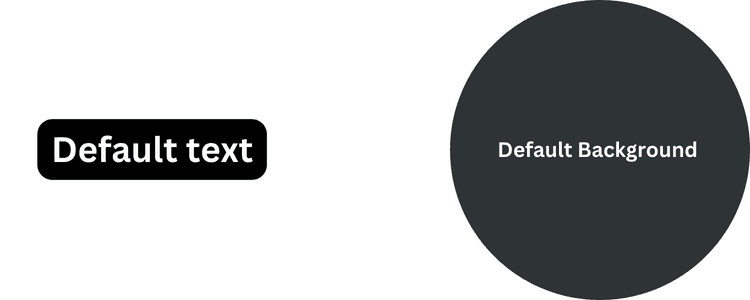
Default Color
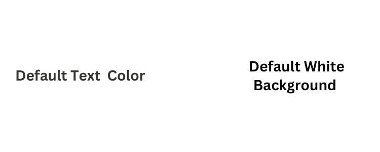
Text: #37352F - Background: #FFFFFF
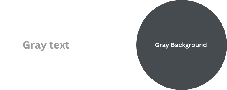
Gray
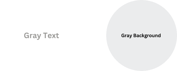
Text: #9B9A97 - Background: #EBECED
Red
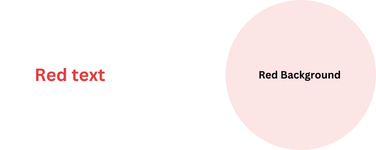
Text: #E03E3E - Background: #FBE4E4
Pink
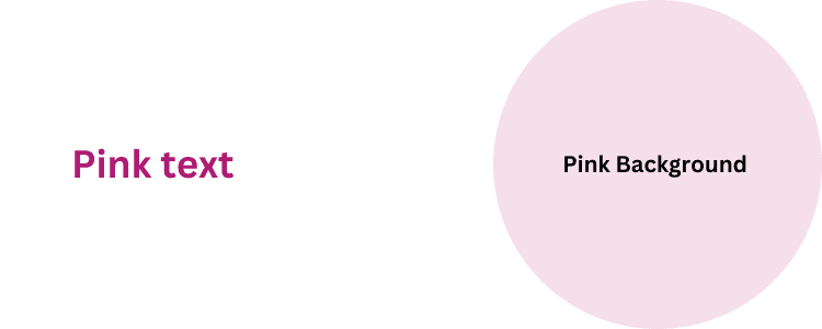
Text: #AD1A72 - Background: #F4DFEB
Purple
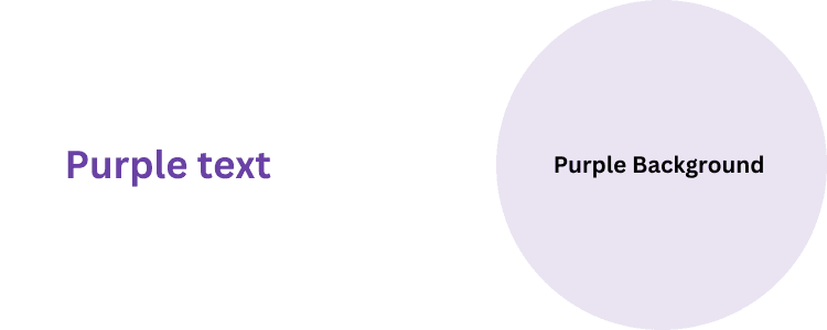
Text: #6940A5 - Background: #EAE4F2
Blue
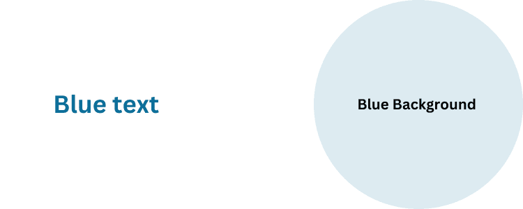
Text: #0B6E99 - Background: #DDEBF1
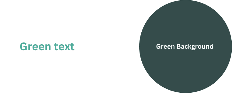
Green
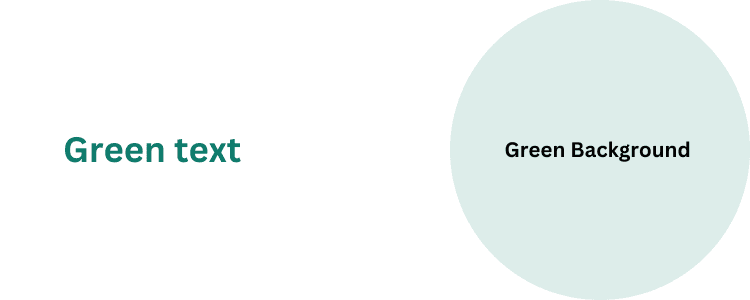
Text: #0F7B6C - Background: #DDEDEA
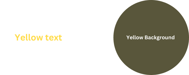
Yellow
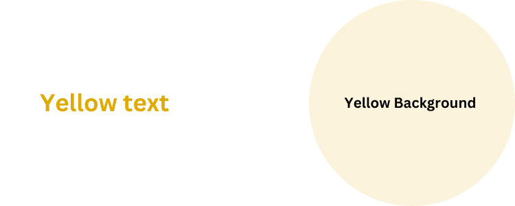
Text: #DFAB01 - Background: #FBF3DB
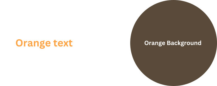
Orange
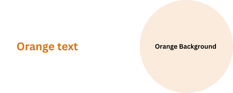
Text: #D9730D - Background: #FAEBDD
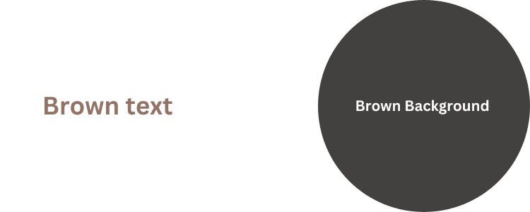
Brown
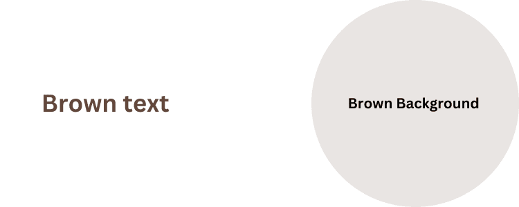
Text: #64473A - Background: #E9E5E3
Notion Dark Mode Colors
Default
Text: #FFFFFF - Background: #2F3437
Gray
Text: #979A9B - Background: #454B4E
Red
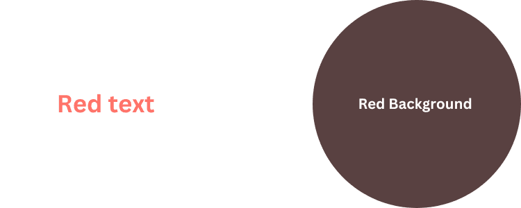
Text: #FF7369 - Background: #594141
Pink
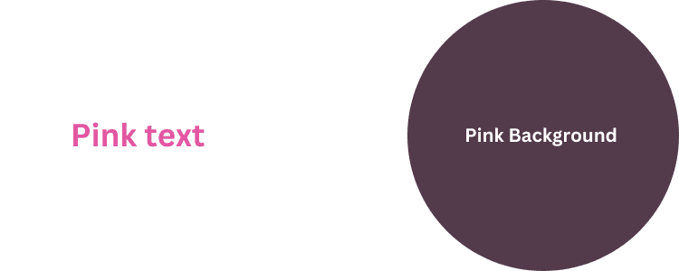
Text: #E255A1 - Background: #533B4C
Purple
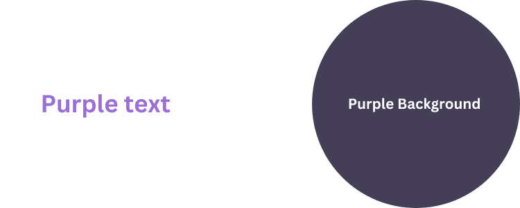
Text: #9A6DD7 - Background: #443F57
Blue
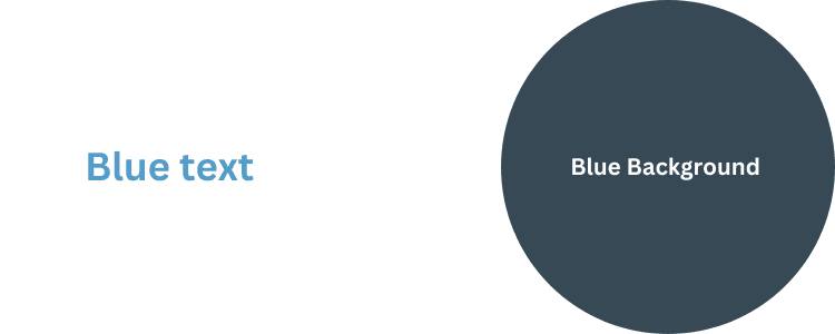
Text: #529CCA - Background: #364954
Green
Text: #4DAB9A - Background: #354C4B
Yellow
Text: #FFDC49 - Background: #59563B
Orange
Text: #FFA344 - Background: #594A3A
Brown
Text: #937264 - Background: #434040
The Significance of Colors in Notion's Design Philosophy
In Notion's design philosophy, colors are not mere decorative elements; they are fundamental in shaping the user's experience.
The choice of colors in Notion reflects a balance between aesthetics and functionality.
Each color palette is selected to improve visual clarity and facilitate intuitive navigation through the app.
Understanding Notion's Top Colors and Their Uses
Here's a list of the most popular colors in Notion, each with its unique symbolism and potential use case:
- Blue: Symbolizes productivity and calmness. Ideal for project management pages and to-do lists.
- Green: Represents growth and stability. Great for personal development plans and financial tracking.
- Orange: Energizes and stimulates creativity. Suitable for brainstorming sessions and creative workspaces.
- Red: Indicates urgency and importance. Perfect for highlighting deadlines, critical tasks, or important reminders.
- Pink: Associated with creativity and playfulness. Can be used for ideation, artistic projects, or personal journals.
- Purple: Often represents wisdom and luxury. Ideal for brainstorming areas or pages dedicated to learning and exploration.
- Yellow: Radiates optimism and positivity. Excellent for highlighting achievements, positive feedback, or motivational quotes.
Expert Tips and Tricks
Here are some expert tips and tricks to use colors effectively in Notion:
- Consistency is Key: use a consistent color scheme throughout your pages for a cohesive look. This helps in quick navigation and reduces visual clutter.
- Color Coding: assign specific colors to different types of projects. For instance, use a particular shade for urgent tasks, another for ongoing projects, and so on. This visual categorization aids in prioritizing and managing your workload more efficiently.
- Accentuate with Colors: use brighter colors to highlight key points. This draws immediate attention to crucial information.
- Themes and Moods: Experiment with color combinations to set themes or moods for your pages. For example, use calming blues and greens for personal journals or vibrant oranges and reds for brainstorming areas.
- Balance and Harmony: while it's tempting to use multiple colors, maintaining a balance is essential. Too many colors can be distracting. Aim for a harmonious blend that's pleasing to the eye and conducive to focus.
- Custom Colors for Branding: If you're using Notion for business, align the color scheme with your brand colors. This reinforces brand identity and makes your workspace uniquely yours.
Conclusion
By understanding notion colors effectively, you can transform your Notion experience into something that is visually appealing.
So, dive in and start experimenting with different color combinations. Embrace the creativity that Notion's color palette brings to your organizational tasks, making your work reflect your personal style.
In addition, tools like EmbedNotion.com offer even more versatility. Our innovative platform allows users to seamlessly integrate their Notion pages directly into their websites. Whether it's showcasing portfolios, managing brand assets, or sharing educational content like student assignments, EmbedNotion.com provides an easy solution to control and display your content directly from Notion.
Ready to elevate your website with Notion's dynamic pages? Visit EmbedNotion.com and start embedding!


