Why Notion Cover Sizes Matter for Modern Workspaces
For anyone building a professional Notion workspace—whether you’re a content creator, designer, freelancer, or part of a collaborative team—the details behind Notion cover sizes can make a surprising difference. A carefully selected and correctly sized cover image is more than just decoration; it’s a building block for visual consistency, strong branding, and an exceptional user experience.
According to Best Notion Cover Size & Dimensions, using the right cover image size helps your Notion pages look sharp and polished, no matter where or how they’re viewed. When covers are optimized, they set the tone for your workspace, reinforce your brand identity, and invite users into a thoughtfully curated environment.
The Role of Visual Consistency and Branding
When every Notion page in your workspace shares consistent, well-sized covers, the result is a cohesive look and feel. This visual consistency isn’t just pleasing to the eye—it organizes your digital workspace and subtly guides collaborators, clients, or viewers through your content. For businesses and teams, it’s also an opportunity to align Notion’s interface with the company’s style guide, logo palette, or campaign theme. The right cover dimensions ensure that logos, imagery, and colors display properly, strengthening your branding with every page view.
Elevating User Experience With the Right Cover Image
A well-sized Notion cover image also improves user experience. If a cover is too small, blurry, or oddly cropped, it sends the wrong message—one of rushed or unprofessional work. Conversely, a properly scaled image communicates attention to detail and makes navigation more enjoyable. Importantly, Notion cover sizes need to adapt across devices: the same page might be viewed on a laptop, tablet, or phone, and the cover must look great on all of them.
When you understand optimal notion cover sizes, you avoid distractions like awkward cropping, distorted images, or mismatched layouts. Instead, you achieve a workspace that feels as professional as any website or branded portal.
Why Sizing Details Matter for Creators, Teams, and Freelancers
Content creators and freelancers often use Notion to showcase work, deliver client projects, or publish digital products. For teams, Notion pages might serve as living documentation, project hubs, or even public-facing brand assets. In each case, the right cover sizes are essential for making a strong first impression and keeping the interface clean and inviting.
If you’re aiming for a portfolio-ready Notion setup, or simply want internal dashboards that inspire productivity, getting cover image details right is a powerful advantage. As you’ll see in the next section, standardizing cover dimensions is the first step—setting the stage for more advanced customization and seamless cross-device presentation.
Next, we’ll break down the foundational sizing standards and aspect ratios every Notion user should know, so your covers look flawless everywhere they’re seen.
Foundations: Standard Notion Cover Dimensions & Aspect Ratios
Understanding standard Notion cover sizes is essential for anyone aiming to create a visually consistent and professional workspace. A well-chosen cover image size ensures that your branding remains sharp and your Notion pages deliver a seamless user experience—regardless of device. Let’s break down the most up-to-date recommendations so your Notion covers not only look great but also function effectively within a responsive design.
The Latest Cover Image Size Recommendations
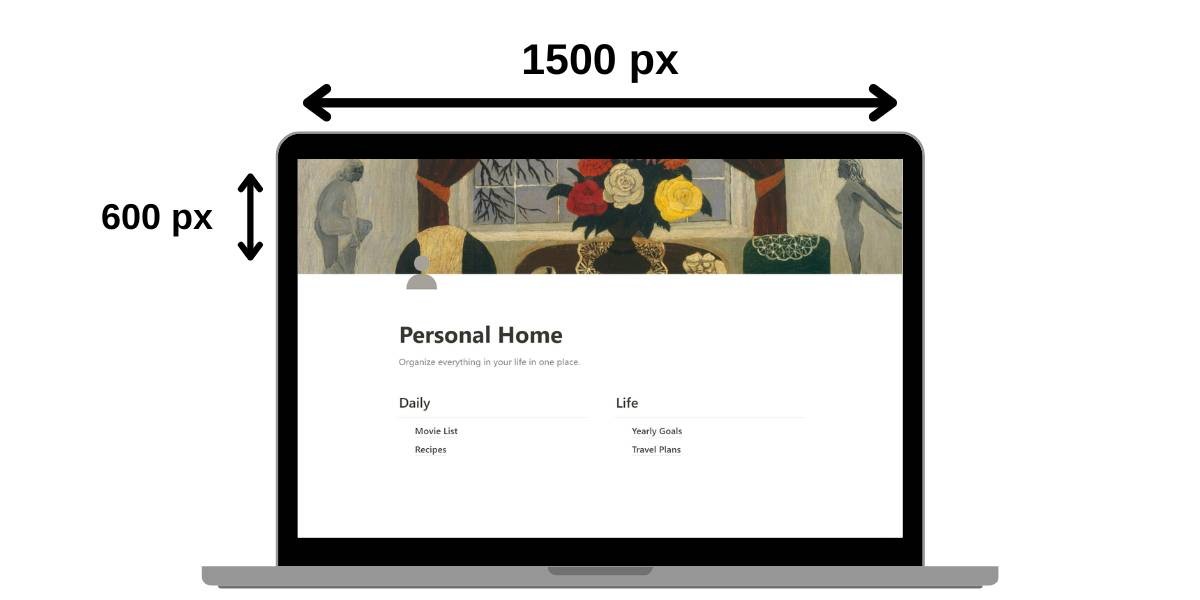
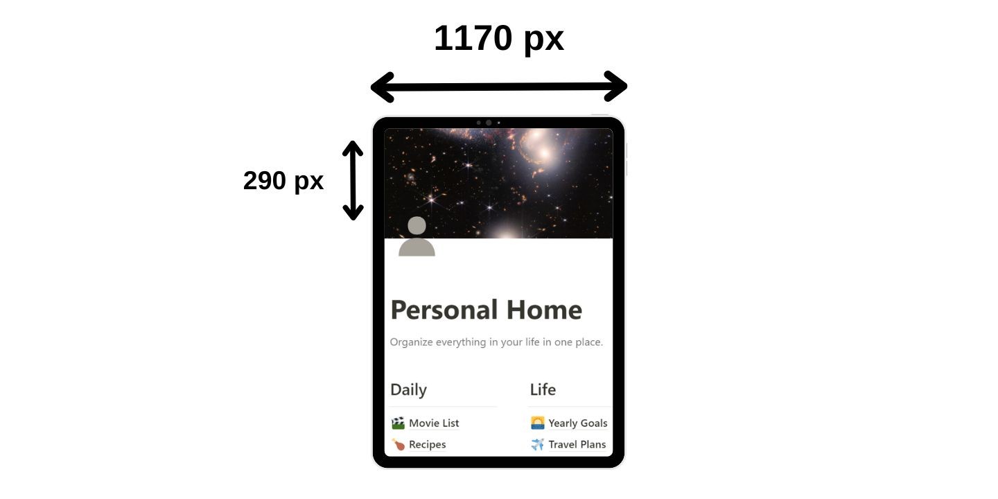
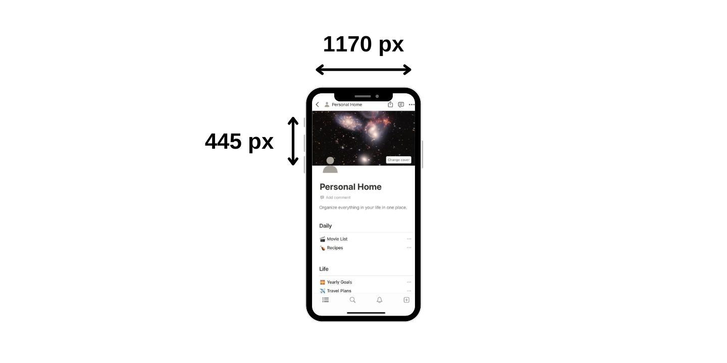
Multiple expert guides agree that the most reliable Notion cover size for desktop is 1500 pixels wide by 600 pixels high (a 5:2 aspect ratio). This dimension offers the best balance between high resolution and performance, keeping your design crisp across modern monitors. For mobile devices, the recommended size is 1170 pixels wide by 445 pixels high, and for tablets, 1170 pixels wide by 290 pixels high. These standards are also echoed in resources such as the Notion Cover Image Size and Dimensions Guide (2026), which provides clear breakdowns for each device type.
Why do these exact numbers matter? Notion’s layout is responsive, meaning it adapts your cover across different screen sizes and ratios. If you want your workspace to look polished on every display, it’s crucial to pick a cover image size that fits the largest required dimensions without blurriness or awkward cropping. Sticking to these recommendations delivers the best results for both aesthetics and functionality.
Aspect Ratio and Safe Zones
Choosing the right aspect ratio is as important as picking the right pixel dimensions. For most covers, a 5:2 ratio works perfectly on desktop, while mobile and tablet covers are closer to 2.6:1 or 4:1, respectively. Sticking to these proportions helps prevent unpleasant surprises, like losing important visual elements when your workspace is viewed on a different device.
Additionally, always consider the “safe zone” when designing a cover image. The safe zone is the central area of your cover where key branding visuals—logos, titles, or focal imagery—should be placed so they don’t get cropped on smaller screens or in gallery views. The Notion Cover Sizes: Complete Guide (2024) explains that for full flexibility, designing on a 1500px by 600px canvas and positioning your important content within a 1170px by 230px central zone yields the most reliable cross-device appearance.
Practical Tips for Responsive Design
- Always start with the largest recommended cover image size (1500x600px) to future-proof your workspace visuals.
- Double-check your images on different devices by previewing your Notion page on desktop, tablet, and mobile. This helps catch any issues with screen adaptation before publishing.
- Keep important branding elements centralized to fit within the safe zone, ensuring legibility and professional appearance everywhere.
By following these pixel guidelines, leveraging the correct aspect ratio, and prioritizing a responsive design mindset, you set the stage for covers that adapt smoothly across all platforms—key for anyone using Notion as a collaborative or client-facing tool.
Next, we’ll explore how Notion renders cover images on desktop, mobile, and tablet—diving even deeper into real-world examples and actionable cover display strategies for superior cross-device compatibility.
Device-by-Device: How Notion Covers Display on Desktop, Mobile, and Tablet
Ensuring cross-device compatibility is essential when optimizing your Notion workspace. The way a Notion cover displays on desktop, tablet, or mobile isn’t just a technical detail—it’s a core part of your page’s visual identity and overall cover display. Choosing the right size and understanding how images adapt across screens will help you maintain a consistent, professional look for yourself, your team, or your clients.
To start, let’s break down the most widely recommended Notion cover sizes by device. According to the Super.so Notion Cover Image Size Guide, ideal dimensions are:
- Desktop: 1500 x 600 pixels (5:2 aspect ratio)
- Mobile: 1170 x 445 pixels
- Tablet: 1170 x 290 pixels
These sizes reflect how Notion’s interface crops and scales cover images, ensuring your content looks sharp and visually balanced no matter where it's viewed. For most users, designing your covers on a 1500 x 600 px canvas is a safe bet—it provides enough resolution and flexibility to adapt to different screens.
Desktop Display
On desktop, the full 1500 x 600 px image is often visible. This is where you have the most creative freedom: branding elements, large visuals, and text overlays can all be used effectively. However, remember that Notion overlays your page title and menu near the center, so it’s best to avoid placing critical content in those areas.
Mobile Display
Mobile screens crop the image tighter, using 1170 x 445 px, which means the sides may be trimmed, and the vertical display is slightly squarer. This screen adaptation can sometimes cut off important elements, so always preview your cover on mobile before finalizing. It’s a good practice to keep your focal point centered and avoid edge-heavy designs.
Tablet Display
Tablet devices use a 1170 x 290 px crop—a much slimmer, letterbox-like area. Here, even more of the top and bottom will be trimmed. Focus your visual content near the center “safe zone” so your cover remains impactful in this tighter frame.
For a deeper visual reference, the Notion Cover Sizes: Complete Guide (2024) demonstrates how each device crops the same image and offers actionable diagrams for planning your designs.
Practical Tips for Cross-Device Perfection
- Always center key visuals or text within the central band of your image.
- Test your covers by uploading and previewing on multiple devices.
- Use high-resolution images to prevent blurriness, especially if your workspace includes retina or 4K screens.
- Remember: Notion overlays may cover up parts of your image, so leave space near the center and top for titles and navigation.
By planning for cross-device compatibility, you ensure your Notion covers are both attractive and functional—setting a high bar for your cover display across any device. As discussed in [Foundations: Standard Notion Cover Dimensions & Aspect Ratios], understanding these technical underpinnings enables you to take the next step: designing standout covers that leverage creative and technical best practices. In the following section, we’ll explore actionable strategies to help your Notion pages stand out visually and effectively.
Designing Standout Notion Covers: Creative and Technical Best Practices
Creating a visually compelling Notion cover is about more than simply uploading an image. Industry experts agree that attention to detail in design and technical preparation is essential for cover customization and ensuring your Notion workspace stands out.
1. Choose the Right Dimensions and Aspect Ratio
To maximize impact and visual consistency, always start with the recommended Notion cover sizes. According to Notion Cover Size Guide: Best Dimensions & Tips (2025), the ideal desktop cover is 1500px by 600px. A 5:2 aspect ratio ensures your image isn’t distorted and aligns beautifully with Notion’s layout. For mobile and tablet, consider 1170px by 445px and 1170px by 290px, respectively. Sticking to these standard dimensions helps maintain branding visuals and offers a professional, polished look across devices.
2. Safe Zones and Cropping Pitfalls
Notion displays covers differently depending on device, so always design with “safe zones” in mind. Keep key elements—such as text, logos, and focal imagery—centered and away from the far edges to prevent unwanted cropping. Preview your image on both desktop and mobile before finalizing to ensure critical information isn’t cut off. This practice protects the integrity of your branding and creates a harmonious viewing experience for all users.
3. File Formats for Quality and Speed
Select efficient file formats to balance image clarity and fast loading times. JPG is ideal for photographs due to its compression, while PNG works better for illustrations, graphics, or covers that require transparency or crisp edges. Always compress images before uploading to Notion to prevent slow page loads—this is especially important for users accessing your workspace on mobile devices.
4. Leveraging Color, Typography, and Imagery
Your Notion cover is the visual gateway to your workspace. Use on-brand colors and consistent typography to reinforce your identity and enhance branding visuals. Bold, readable fonts and a unified color scheme help your page look curated rather than pieced together. When choosing images, opt for high-resolution visuals that reflect the tone of your content—whether it’s a vibrant abstract for a creative portfolio or a calming landscape for documentation sites.
5. Custom Covers for Unique Brands
Don’t be afraid to tailor your covers for specific purposes. For portfolios, overlays with name and role can add personality. For documentation or internal wikis, subtle gradients or illustrated graphics maintain professionalism while signaling content type. The key is balancing creativity with usability so every cover reinforces your workspace’s unique character.
For more inspiration and technical tips, check out the Best Notion Cover Size & Dimensions and the thorough guidance from Gridfiti’s Notion Cover Image Dimensions.
With these creative and technical best practices, your Notion pages will be both eye-catching and functional. Next, we’ll walk through how to implement these covers directly in Notion and master their positioning for a seamless workspace experience.
How to Add, Position, and Reposition Notion Covers Like a Pro
Mastering the art of adding covers and fine-tuning their position in Notion is key to creating a workspace setup that stands out—whether you’re a freelancer building polished client dashboards or a team collaborating on internal knowledge bases. By understanding the practical steps and best practices, you’ll ensure your Notion pages always look intentional and professional.
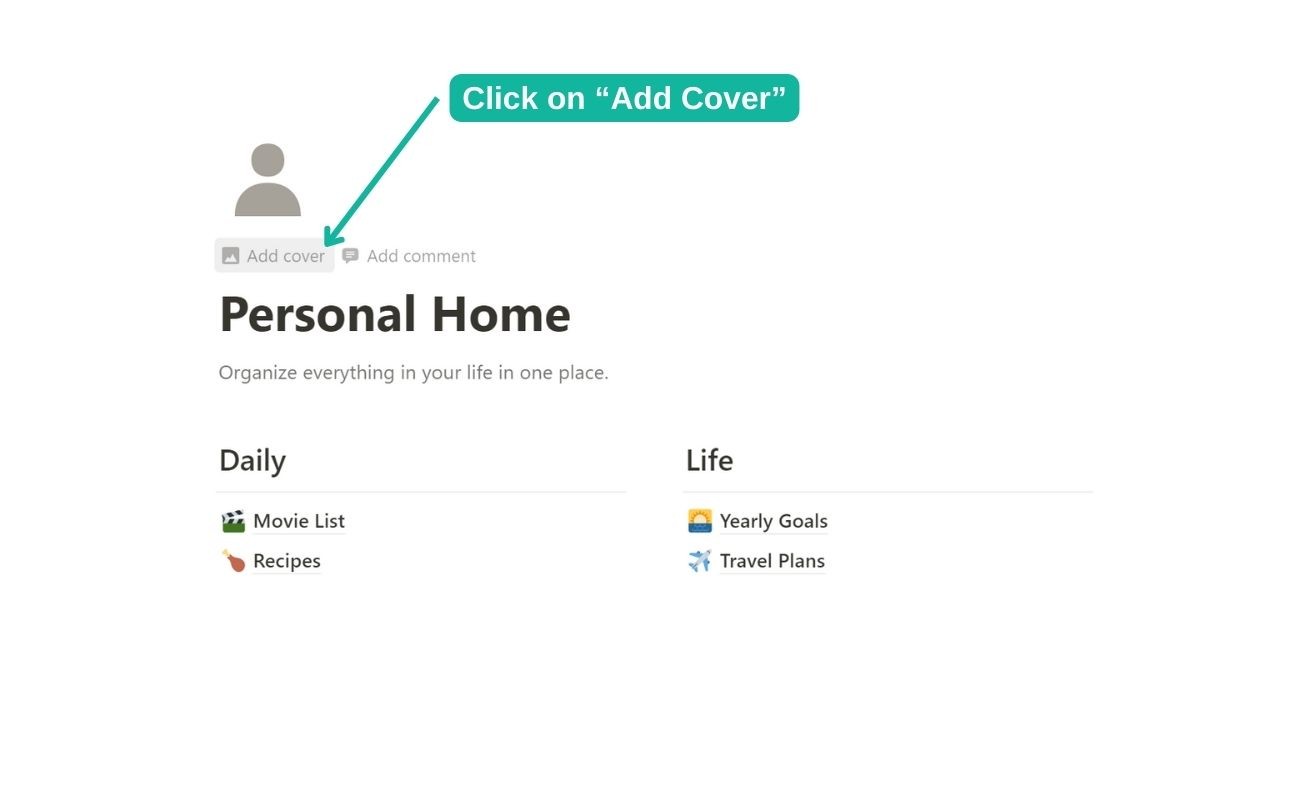
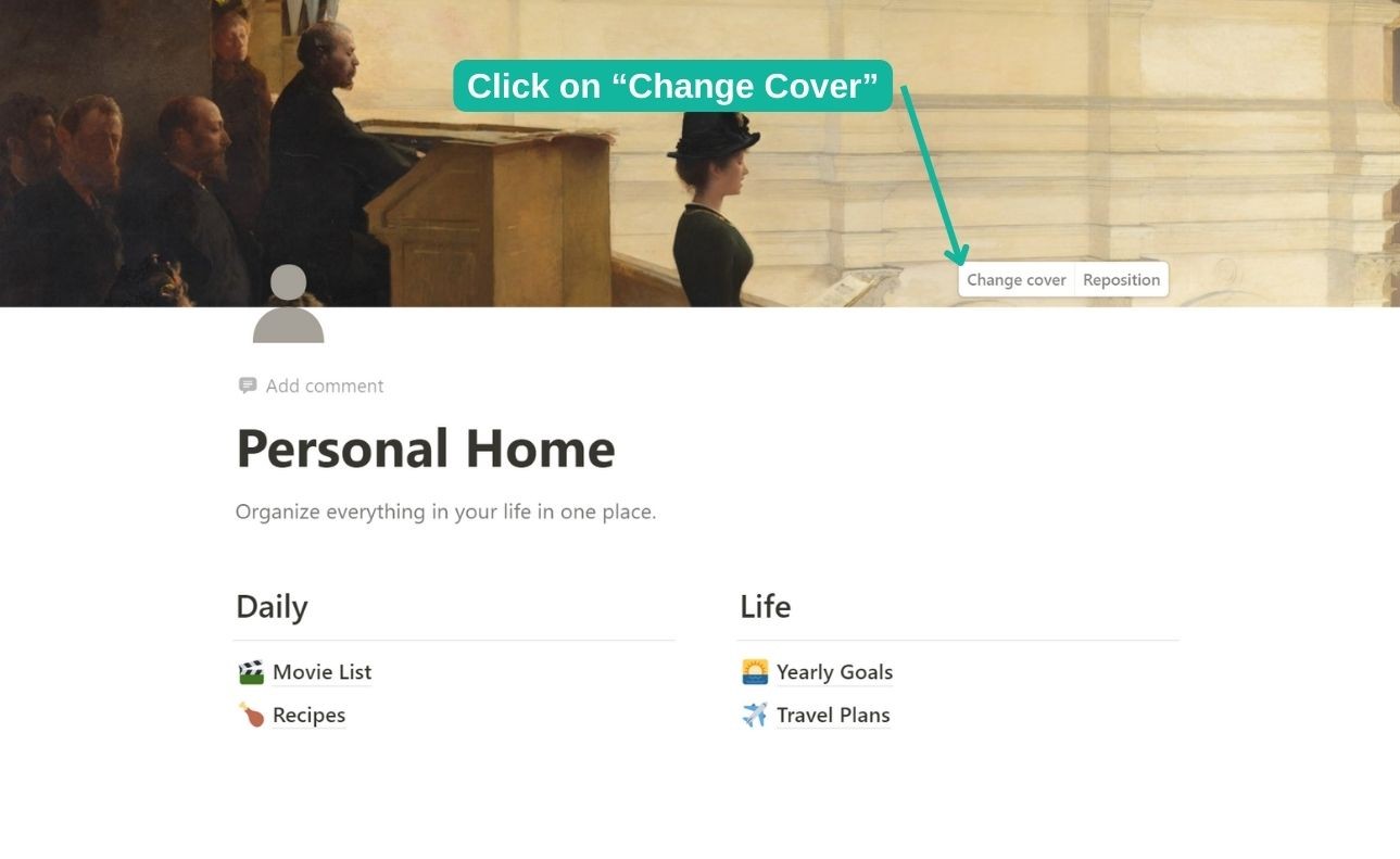
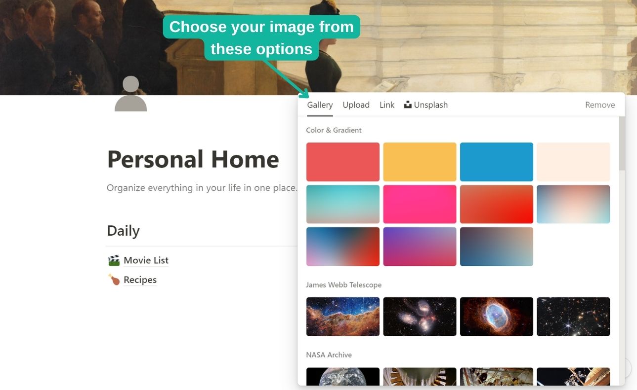
To begin with, Notion makes it easy to add a cover to any page. According to the Notion Cover Size Guide: Best Dimensions & Tips (2025), here’s how you can add a cover image:
- Navigate to your target Notion page.
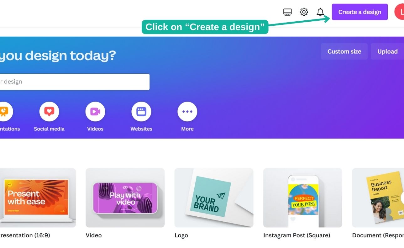
- Click on “Add cover” at the top of the page.
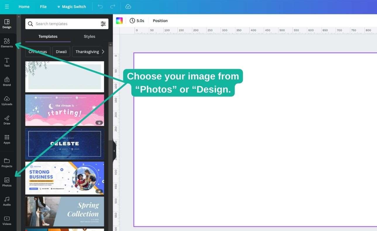
- Choose an image from Notion’s gallery, upload your own, or paste an image link.
- Once your image is added, Notion will automatically size it, but you can reposition it for the perfect fit.
Image Repositioning and Cropping
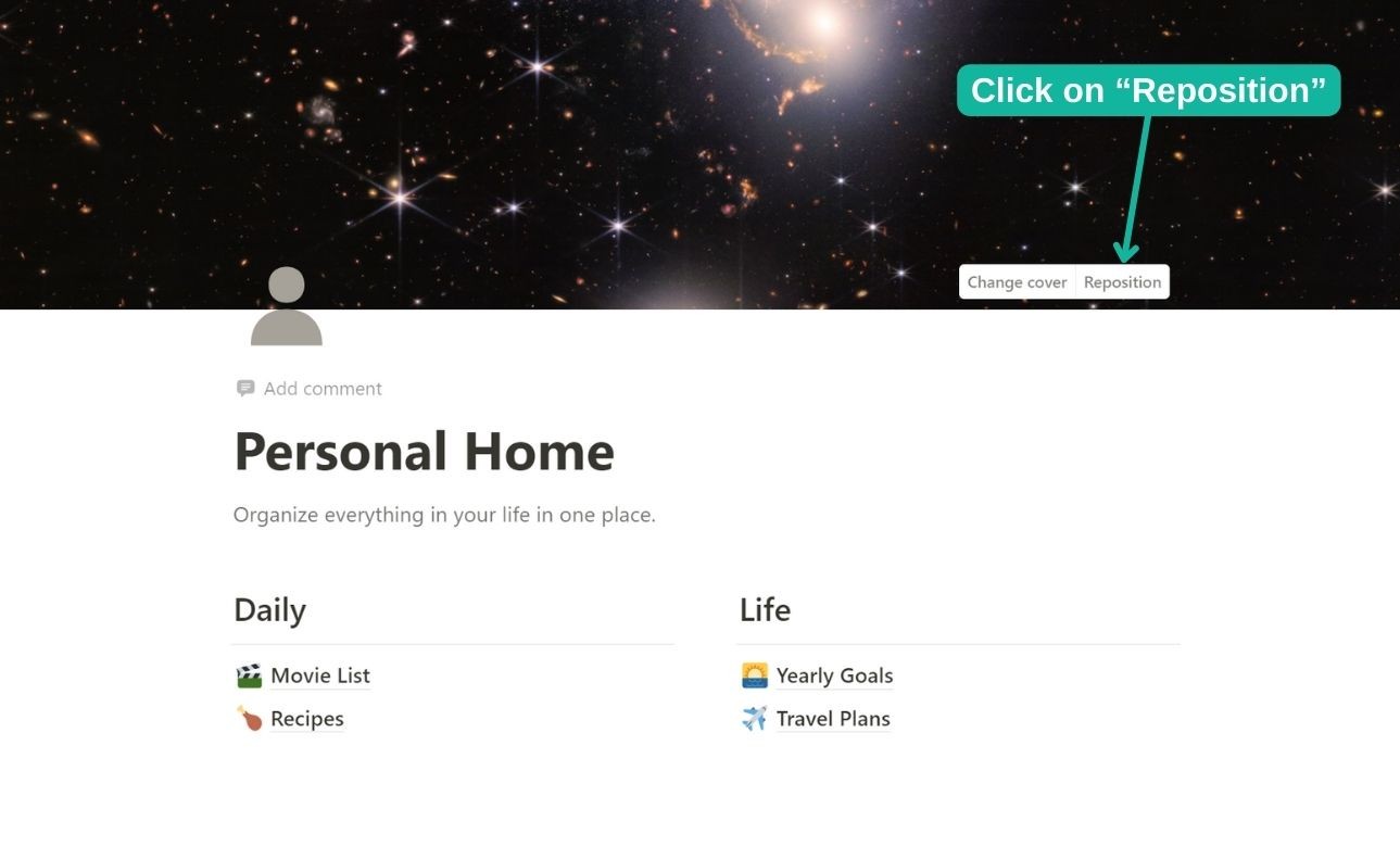
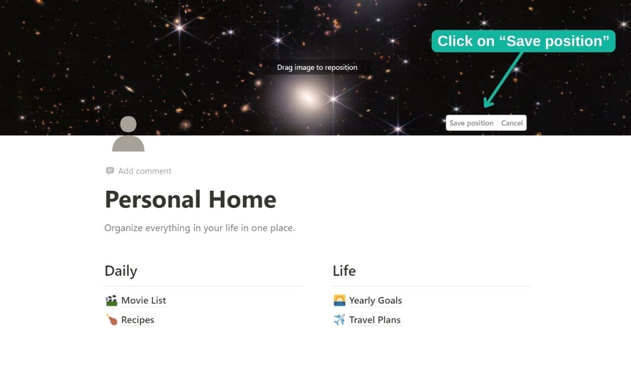
Notion’s “Reposition” feature is essential for achieving the right visual balance. After uploading, click the “Reposition” button on your cover image. This allows you to shift the image vertically, choosing which section of your chosen image will be visible. This step is crucial for maintaining image repositioning consistency across different devices and avoiding awkward cropping—especially if you’re using custom artwork or branded visuals.
When you’re previewing covers, remember that Notion’s cover area crops images differently based on device and window size. Workspace setup varies widely, so always check your page on both desktop and mobile to verify alignment. If you’re managing multiple projects or team pages, consider sticking to the recommended dimensions (like 1500px by 600px for desktop) to keep workspace visuals sharp for everyone.
Ensuring Alignment Across Views
Cover images also appear in Notion gallery, board, and database views. To maintain a cohesive appearance:
- Add covers to each page in a gallery for uniform presentation.
- Use similar image styles or branded templates to reinforce your identity.
- Preview your workspace in different views to ensure covers align neatly.
By making image repositioning a regular part of your Notion workflow, you’ll avoid the most common issues related to odd cropping and misalignment—key aspects of a reliable workspace setup for growing teams and agencies.
As discussed in [Device-by-Device: How Notion Covers Display on Desktop, Mobile, and Tablet], the way covers adapt is influenced by screen size and context. If you encounter any display hiccups or find that your cover just doesn’t look right after these tweaks, don’t worry—the next section will help you troubleshoot common notion cover sizes issues and maintain perfect display consistency.
Troubleshooting Notion Cover Size Issues: Common Pitfalls & Fixes
Even with a solid grasp of recommended notion cover sizes, it’s common to encounter frustrating image issues that disrupt the visual consistency of your workspace. Let’s dive into frequent cover image issues, why they happen, and practical troubleshooting steps—so your pages remain professional and sharp on any device.
Blurry or Pixelated Covers:
One of the most prevalent problems is a blurry or pixelated cover image. This usually occurs when the uploaded image is below the optimal resolution. Notion displays covers at 1500×600px on desktop, 1170×445px on mobile, and 1170×290px on tablets (Best Notion Cover Size & Dimensions). Using images smaller than these dimensions can result in unwanted upscaling and significant quality loss. For best results, always start with an image sized to at least 1500×600px.
Odd Cropping and Unexpected Trimming:
Notion automatically crops cover images to fit its aspect ratios, and the display area can shift depending on the device. If your design features crucial visuals or text near the edges, they may be cut off, especially on mobile or tablet. To prevent this, keep key content centered and leave generous margins (“safe zones”)—as outlined in guides like Notion Cover Image Size and Dimensions Guide (2026). Test your cover on desktop and mobile to ensure nothing essential is lost in cropping.
Inconsistent Display Between Devices:
You might notice your cover looks perfect on desktop but awkwardly cropped or stretched on your phone. This is due to responsive design and differences in aspect ratio: desktop uses a 5:2 ratio, while mobile and tablet are closer to 2.6:1 and 4:1, respectively. To maximize display consistency, stick with the recommended notion cover sizes, avoid putting important elements near the top or bottom edge, and preview your pages on multiple devices whenever possible.
Cover Image Issues in Gallery Views:
Gallery views in Notion handle cover images differently than standard page headers. Sometimes, covers appear squashed or stretched, especially if you’ve uploaded a tall or narrow image. The solution: crop your image to the standard cover aspect ratio before uploading, and select “Fit” instead of “Fill” when positioning the gallery cover if possible (Notion Cover Size & Dimensions). This helps maintain display consistency across individualized gallery cards.
Troubleshooting Steps at a Glance:
- Start with high-resolution images—1500×600px minimum.
- Center key visuals and text; allow for safe zones.
- Test on desktop, tablet, and mobile to ensure screen adaptation.
- Reposition covers using Notion’s built-in reposition tool for minor tweaks.
- If issues persist, re-crop and re-upload your image, double-checking the dimensions.
By applying these troubleshooting tips, you’ll resolve most cover image issues and ensure your workspace maintains a polished, professional look. As we transition to the next section, discover how you can seamlessly integrate perfectly sized Notion pages into any website builder—making display consistency effortless beyond Notion itself.
Seamlessly Display Perfect Notion Covers Anywhere with Embed Notion
Perfecting your Notion workspace goes beyond choosing the right notion cover sizes—it’s about ensuring your covers look sharp and professional everywhere your content appears. Throughout this guide, we’ve explored dimensions, device-specific display, creative best practices, and troubleshooting to achieve visual consistency across platforms. But what happens when you want to share your Notion pages beyond the app itself—on a company website, a client portal, or a digital portfolio?
Embedding Notion pages is the answer, and with Embed Notion, this process is now seamless and tailored for modern digital needs. Whether you’re managing a personal site on WordPress, launching a resource hub on Webflow, or building a client dashboard on Wix, Embed Notion enables you to embed Notion pages complete with perfectly sized covers—no matter the website builder.
Why Responsive Integration Matters
When Notion covers are displayed on external sites, maintaining aspect ratio and responsive design is essential for a polished appearance and strong branding. According to the Notion Cover Size & Dimensions guide, using optimized cover sizes like 1500×600 px for desktop or 1170×445 px for mobile ensures your visuals remain crisp and professional. However, manually handling embeds and hoping for cross-device compatibility can lead to inconsistent results, especially as websites and devices evolve.
Embed Notion solves these challenges by offering responsive integration that automatically adapts your Notion pages—including covers—to fit any device, from widescreen monitors to smartphones. No more worrying about awkward cropping or display issues; the platform takes care of the technical details so your focus remains on content and design.
Effortless Website Content Management
Whether you update documentation, publish new resources, or refresh your branding visuals, Embed Notion guarantees your changes sync automatically. This streamlines website content management—edit your Notion page once, and every embedded instance updates in real time, saving you hours of duplicated work and ensuring display consistency across all your properties.
You also gain flexibility to customize embed appearance, adjust sizing, and even track engagement via Google Analytics. This empowers freelancers, teams, and agencies to deliver a professional experience without technical headaches.
Take what you’ve learned about notion cover sizes and show off your Notion workspace anywhere online—beautifully and reliably—with Embed Notion. If you’re ready to put your knowledge into practice, start embedding today and ensure your Notion covers always look their best, everywhere they appear.